TOKI×Maker
A browser-only OBS custom clock / timer / count-up editor
Design a clock / timer / count-up overlay for your streaming screen entirely in the browser, then export it as a self-contained HTML file. Fine-grained control over fonts / colors / layout / animation / background / frames / a secondary clock for another timezone, and so on. Just load the exported HTML in an OBS Browser Source to drop it into your stream. No account, no external server, settings persist in the browser's localStorage. Sharable via JSON or URL.
Existing streaming clock widgets tend to be either “barebones digits” or “tied to a specific aesthetic”, which makes it hard to dial them into your own site or brand. TOKI×Maker aims to let you make a clock that fits your own world, without writing code, and drop it into your stream.
Preview → tweak → export HTML → drop into OBS, all in one file. Like Peraravatar, it’s fully client-side, no server required.
- Three modes: Clock / countdown timer / count-up
- Clock types: digital / analog
- Secondary clock (other timezone): 14 presets including UTC / JST / KST + IANA custom
- 23 presets in total: 18 clock / 3 timer / 2 count-up (see Presets)
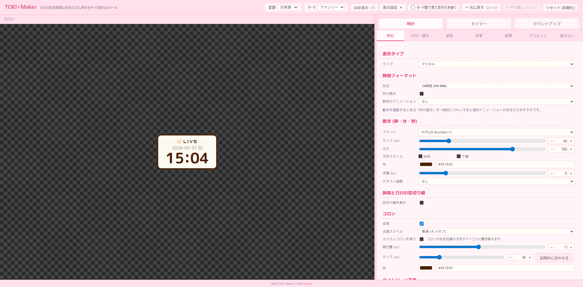
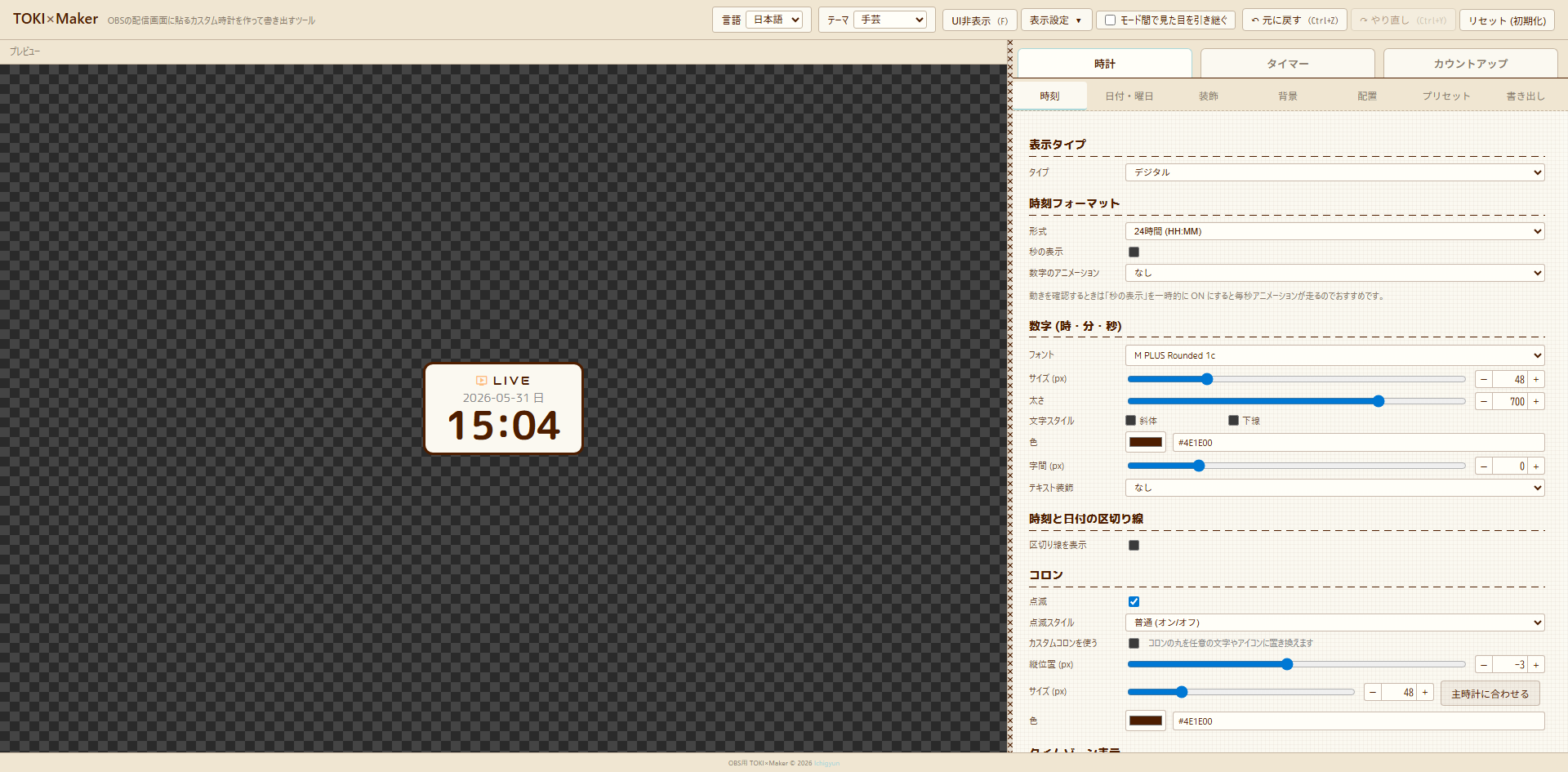
- Four UI themes: Dark / Light / Fancy / Handcraft (cross-stitch style)
- 100+ multilingual fonts: Japanese / Korean / Chinese / Thai / Russian / Mono / Sans / Display / Script
- Text styles: bold / italic / underline / outline / shadow / gradient
- Background: solid / linear/radial gradient / image layers (multiple) / Material Icon stamps
- Borders / frames:
standard border/image (stretched frame)/image (9-slice) - Shape: rectangle / rounded / circle / half-circle (top/bottom) / rounded top or bottom only
- AM/PM styles:
AM / PM/a.m. / p.m./午前 / 午後with individual position / color / style adjustment - Badge: text + Material icons (left/right), 6 animations (blink / pulse / bounce / shake / glow / marquee)
- Date formatting: moment.js-style placeholders (
YYYY/MM/DDetc.), bracket-escape support ([Mar] D [Birthday]) - Layout: rearrange time / date / badge / secondary clock + 9-direction anchor + per-element alignment (left / center / right)
- Export: self-contained HTML / PNG image / clipboard copy / social share / JSON / URL-encoded share (not recommended)
- Auto-save: persisted to localStorage on every change, Undo / Redo (Ctrl+Z / Ctrl+Y)
- Languages: Japanese / English
- UI customization: theme switch / panel position (right / left) / font size (90–150%) / hide UI
- Mobile: stacks vertically on phones (preview above / menu below)
Switch between “Clock / Timer / Count-up” tabs below the header. Each holds its own settings; turn on “Carry look across modes” to bring the current look to other modes.
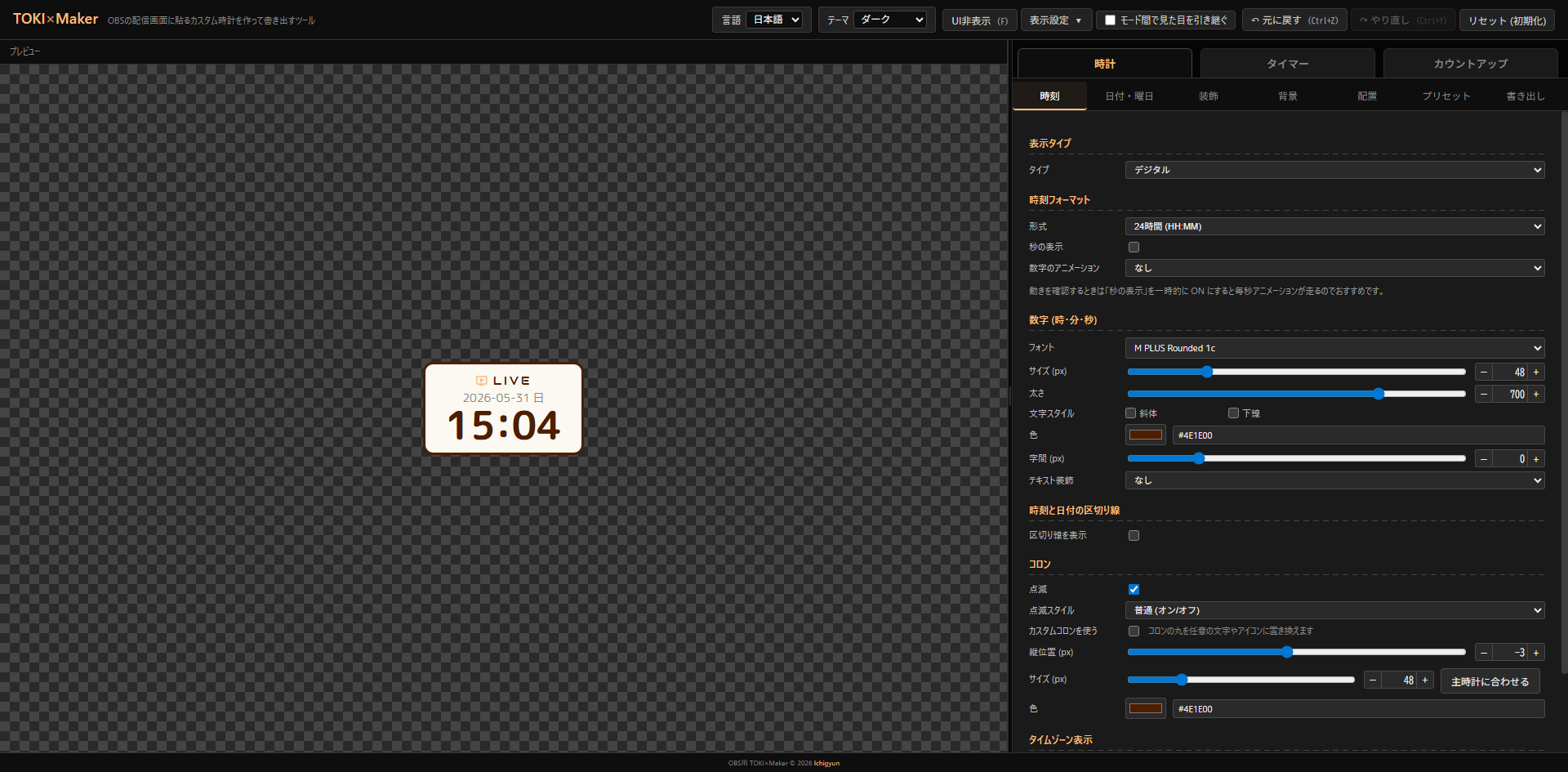
Clock
Shows current time. Toggle digital / analog, secondary clock, display format, AM/PM style, with/without seconds, blinking colon, etc.
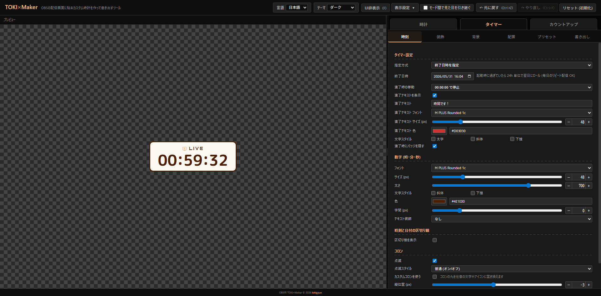
Timer
Remaining time until a target (end datetime) or a fixed duration. If the target time has already passed at startup, the timer auto-rolls forward by 24 hours, so “ends every day at 22:00” only needs to be configured once. Custom “expired” text supported.
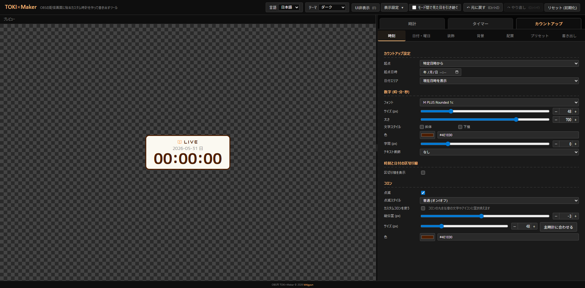
Count-up
Elapsed time from a specified datetime, or “from 0 (page load origin)”. The date area can show the current datetime / start datetime / be hidden. Useful for work-stream / live-stream elapsed displays.
Apply a preset with one click from the “Presets” tab. The fastest workflow is to load one as a base, then tweak in each tab.
Controls: For timer play / pause / reset / editing the end datetime, see Preview and edit popup
Controls: For count-up play / pause / reset / editing the origin datetime, see Preview and edit popup
Click to enlarge (these are actually live)
Clock presets (18)
- Morning
- Night
- Cute
- Dreamy — stretched frame
- Sakura — 9-slice frame
- Paw — stretched frame (wooden paw)
- Craft — 9-slice frame (stitch)
- Chuunibyou
- Cool
- Minimal
- Global — simple clock in IBM Plex Mono + UTC secondary clock
- Neon alarm — bright fluorescent digital
- Classic — analog
- Modern — analog
- Pop — analog
- Cuckoo — analog + stretched frame
- Dark neon — analog
- Yami-kawa — analog + stretched frame (pastel gothic)
Timer presets (3)
- Pomodoro (work 25 min)
- Pomodoro (break 5 min)
- Until stream end — shows “End” when time’s up
Count-up presets (2)
- Stream elapsed
- Days since stream start
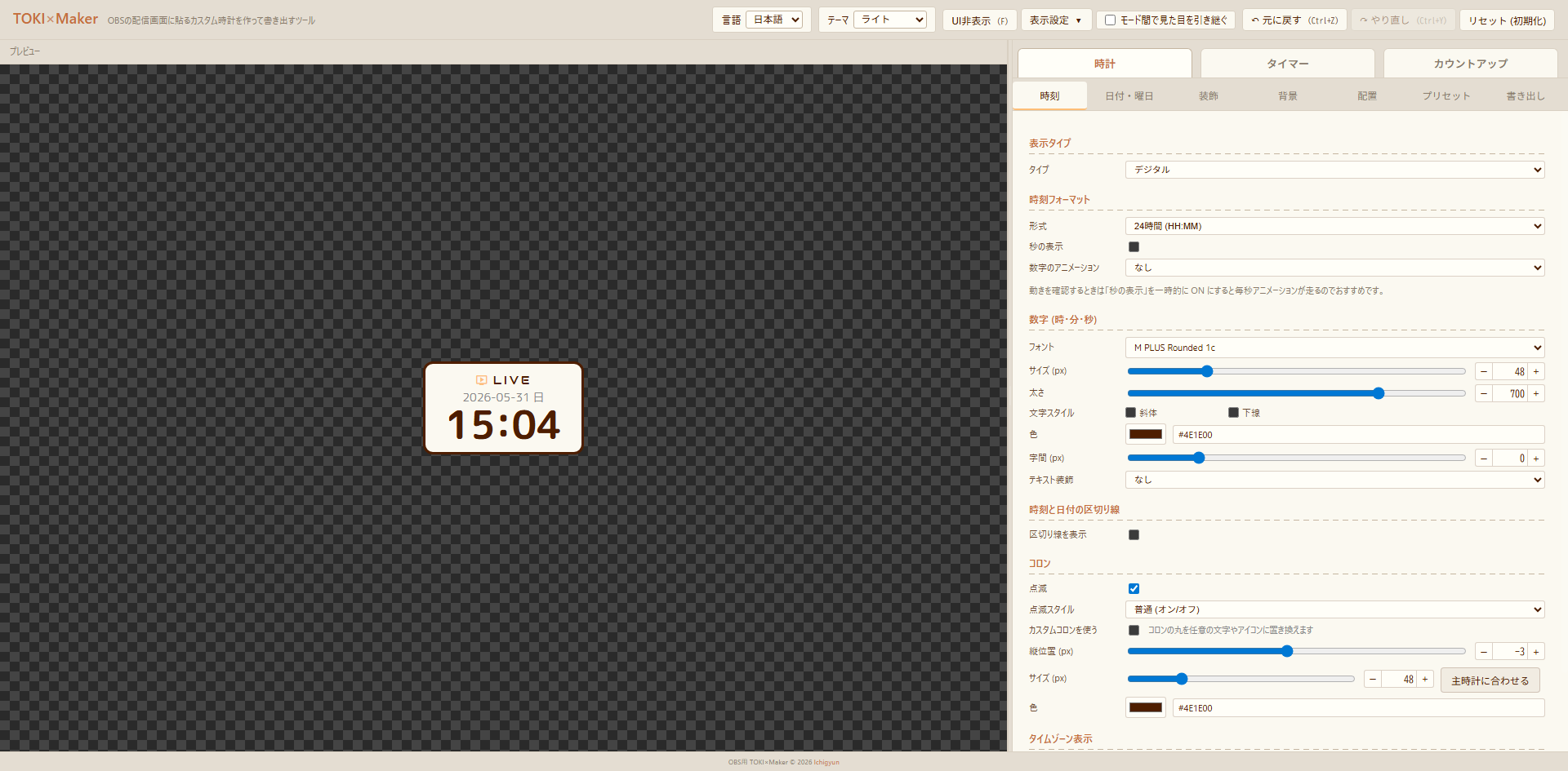
You can switch the editor UI itself from the “Theme” selector at the top right of the header (this does not affect the clock preview).
| Theme | Description |
|---|---|
| Dark | Default. Black background + orange accent |
| Light | Cream background + brown text + orange |
| Fancy | Pastel pink + rounded gothic font (M PLUS Rounded 1c) |
| Handcraft | Canvas-like + ✕-shaped cross-stitch splitter + chunky dashed headings |
Hovering over the time, date, badge, or secondary clock in the preview reveals a ✎ button. Click it to open an inline edit popup just for that element — change font or color instantly.
In timer / count-up modes, playback controls appear at the bottom right of the preview (hidden in clock mode).
- ▶ / ⏸: Play / pause (shortcut:
Space). Only shown for timer “Duration” and count-up “From 0 (page load origin)” (the others run from real time and don’t need pausing) - ↻: Reset (shortcut:
R). Re-initializes timer remaining / count-up origin - ✎: Edit popup (shortcut:
E). Edit timer “end datetime / duration” or count-up “origin datetime” directly. Hidden in count-up “From 0” mode because there’s nothing to edit
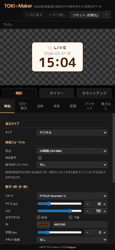
Configures the main time display. Settings change significantly with type (digital / analog), and the secondary clock lives in the same tab. In timer / count-up modes, mode-specific settings (end datetime / duration / expired text) also appear here.
Main sub-sections:
- Time tab - Digital: settings when type is “Digital” (format, digits, colon, AM/PM, etc.)
- Time tab - Analog clock: settings when type is “Analog” (dial / hands, etc.)
- Time tab - Secondary clock (other timezone): show another timezone alongside the primary
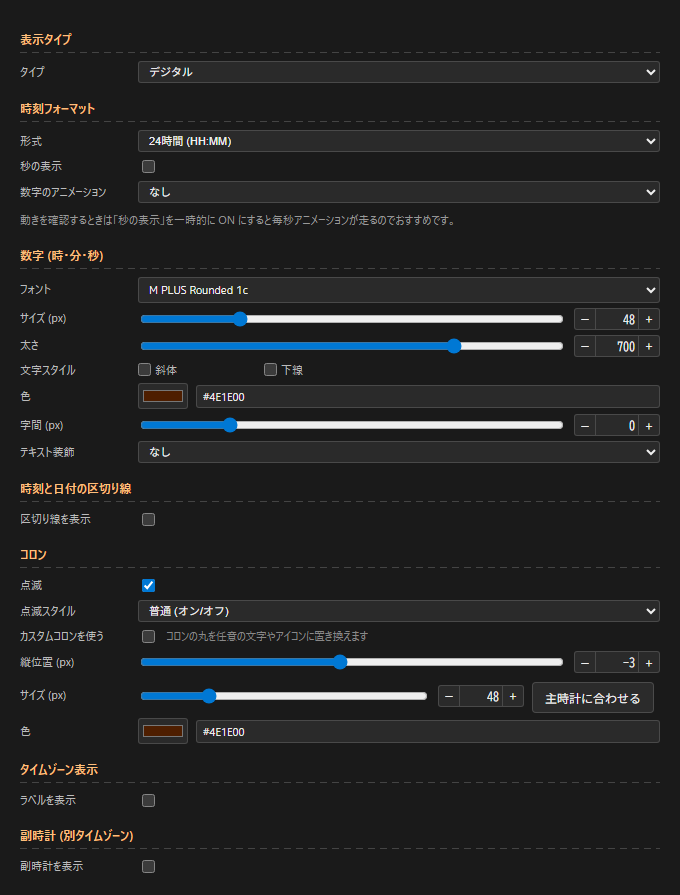
Settings when type is “Digital”.
- Format:
24-hour (HH:MM)/12-hour (h:MM AM/PM)(12-hour enables the AM/PM style section) - Show seconds: ON/OFF
- Digit animation: None / Fade / Slide (up) / Slide (down) / Flip / Scale
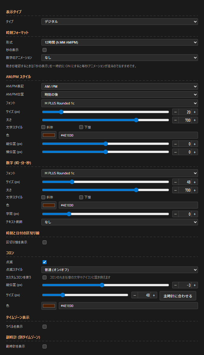
- AM/PM style (12-hour):
- AM/PM text:
AM / PM/a.m. / p.m./午前 / 午後 - AM/PM position: after time / before time / hidden
- Style:
font/size (px)/weight (font-weight 100-900)/text style (italic / underline)/color/offset Y (px)/offset X (px)
- AM/PM text:
- Digits (hours / minutes / seconds):
font/size (px)/weight (font-weight 100-900)/text style (italic / underline)/color/letter spacing (px)- Text decoration: none / neon glow / outline / shadow (blur) / retro shadow (offset)
- Decoration color / decoration strength (px) (when text decoration ≠ none)
- Divider between time and date:
show divider ON/OFF/position (bottom only / top only / both)/color/style (solid / dashed / dotted / double)/width (px)/gap between line and text (px) - Colon:
- Blink ON/OFF
- Blink style:
normal (on/off)/smooth/soft/hard (snap on/off)/glow - Custom colon ON/OFF (when ON, replaces ”:” with any character or Material Symbols icon)
- Symbol type: character / icon
- Symbol type = character: input any character (default ”・”, max 3 chars)
- Symbol type = icon: Material Symbols icon name + style (outlined / filled / round / sharp / two-tone)
- Offset Y (px) / spacing (px)
- Font / size (px) (“Match digits” button syncs to hour/minute/second digit size) / weight (font-weight) / color
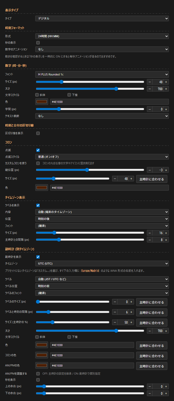
- Timezone label (clock mode + digital only):
- Show label ON/OFF
- Content:
auto (device timezone)/custom - Custom text (free input when content = custom, e.g.
Tokyo) - Position: before time / after time
- Font / size (px) / gap from primary clock (px)
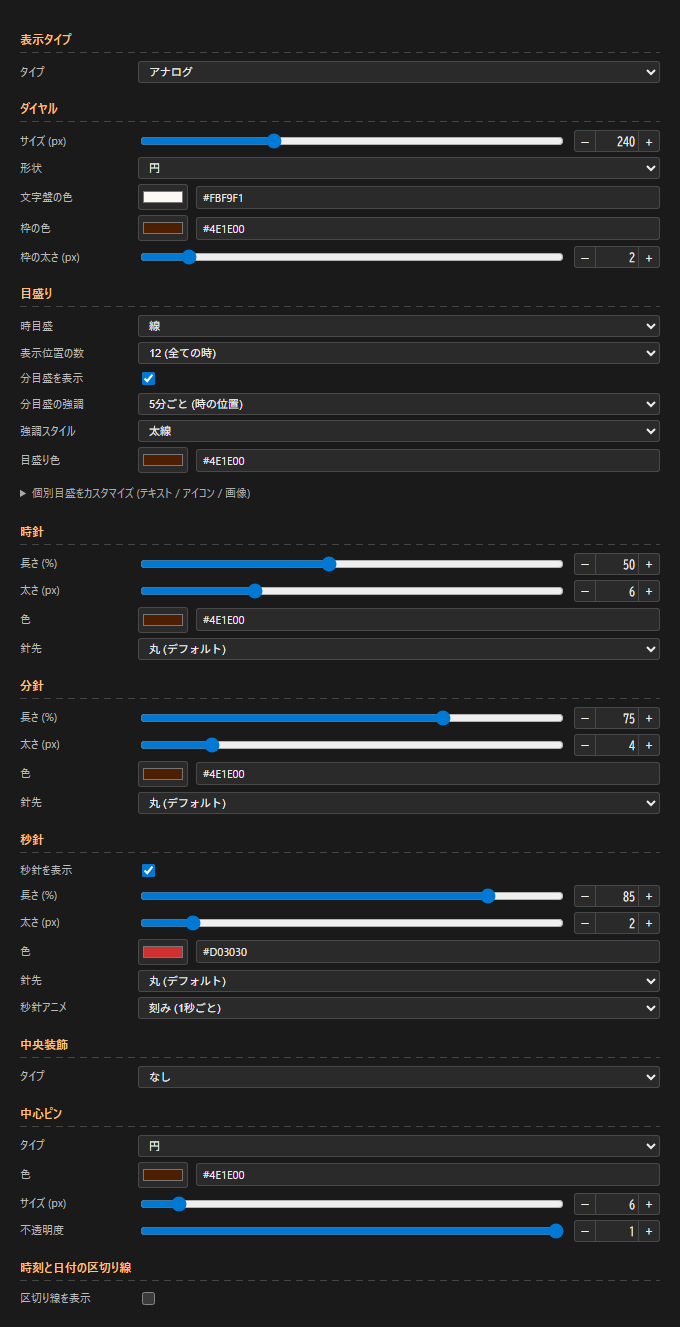
Switching the time tab’s “Type” to “Analog” hides the digital settings and reveals the analog ones.
Dial
size (px)/shape (circle / square)- Face color / border color / border width (px)
Markers
- Hour markers: none / dots / lines / numbers (1-12) / Roman numerals (I-XII)
- Marker positions:
12 (all hours)/4 (only 12 / 3 / 6 / 9) - Numeric font (only when hour markers are “numbers” or “Roman numerals”)
- Show minute markers ON/OFF
- Minute marker accent: no accent / every 3 min / every 5 min (hour positions)
- Accent style: thick / long / colored (only when “colored”, an accent color can be set)
- Marker color
- Customize individual markers: replace each of the 12 hour markers with text / a Material Symbols icon / an image URL
Hour / minute / second hand
- Only the second hand has Show second hand ON/OFF (hour / minute always visible)
- Length (%) / width (px) / color
- Tip: round (default) / flat / arrow / arrow (rounded) / diamond / circle / leaf / image
- Tip size (px) (only for tip shapes that support it)
- Second hand only: Second hand animation: tick (every second) / smooth (sweep)
Center decoration
- An ornament drawn behind the hands (logo / gem / character at the dial center, etc.)
- Type:
none/circle/icon (Material Symbols)/image (PNG / JPG / SVG) - Color / size (px) / opacity
- Fine offset X / Y (px) only for icon / image
Center pin
- A pin drawn in front of the hands (a tack-like accent)
- Type: none / circle (default) / icon / image
- Color / size (px) / opacity
Displays a clock for a different timezone alongside the primary. Useful for streams targeting overseas viewers or for showing JST + UTC together. Only available in clock mode + digital (not shown in analog / timer / count-up).
- Show secondary clock ON/OFF
- Timezone (14 presets + IANA custom):
UTC/JST/KST/CST/SGT/IST/GMT/CET (Europe/Paris)/CET (Europe/Berlin)/ET/CT/PT/AEST/NZST- Custom… (select to type an IANA name like
Europe/Madrid)
- Label:
auto (JST / UTC, etc.)/custom/hide - Custom label (only when label = custom)
- Label position: before time / after time
- Label style: font / size (px) / gap from time (px)
- Size: as a % of the primary clock
- Weight (font-weight 100-900)
- Text style: italic / underline
- Color:
color/colon color/AM/PM color(each has a “Match primary” button to sync to the primary) - Adjust AM/PM: OFF inherits the primary’s AM/PM settings (format / position / style); ON sets them independently
- Format:
24-hour (HH:MM)/12-hour (h:MM AM/PM) - AM/PM position: after time / before time / hidden
- AM/PM text:
AM / PM/a.m. / p.m./午前 / 午後
- Format:
- Show seconds ON/OFF
- Margins: margin top (px) / margin bottom (px)
- Match primary button (6 places):
label size/gap between label and time/size (%)/color/colon color/AM/PM color— each immediately syncs to the primary’s value
Configures whether to show the date and how to format it.
- Show date ON/OFF
- Format: pick a preset (
YYYY-MM-DD/YYYY年MM月DD日/ddd, MMM D, etc.) or choose “Custom…” to enter your own. Presets are grouped as “Numbers (JP)”, “JP + weekday”, “Numbers (international)”, “Month (short)”, “Month + weekday”, “Ordinal / decorative” - Language: Japanese / English (localizes weekday / month names)
- Custom format: free input when format is “Custom…” (e.g.
YYYY/MM/DD,MMM D, YYYY) - Uppercase alphabet ON/OFF (uppercases Latin output)
- Placeholders:
YYYY YY MM M DD D ddd dddd MMM MMMM Do - Bracket escape:
[Mar] D [Birthday]— content inside[...]is output as literal text. Useful for anniversary labels and fixed strings - Font / weekday font: weekday font inherits the date font by default. Override to use a different font for
ddd/ddddonly (e.g. Latin font + Japanese font for the weekday) - Size (px) / color
- Margins: margin top (px) / margin bottom (px) (gap from time / other elements)
- Text style: bold / italic / underline
- Text decoration: none / neon glow / outline / shadow (blur) / retro shadow (offset) + decoration color / decoration strength (px)
- Custom weekday colors: ON to set a separate color for each weekday (Sun / Mon / Tue / Wed / Thu / Fri / Sat) (preview buttons included)
Show a short label (LIVE / 配信中 / 朝活, etc.) above / below / next to the clock — what we call a “badge”.
- Show badge ON/OFF
- Text (e.g.
LIVE,配信中,朝活) - Font / size (px) / color / letter spacing (px)
- Margins: margin top (px) / margin bottom (px)
- Text style: bold / italic / underline
- Text decoration: none / neon glow / outline / shadow (blur) / retro shadow (offset) + decoration color / decoration strength (px)
- Use icon ON/OFF (enables the whole icon group)
- Icon: place Material Symbols on the left and/or right of the badge text
- Left icon / Right icon: pick from the dropdown. “Custom…” reveals an input where you can type any Material Symbols name (e.g.
crown,favorite) - Left style / Right style: outlined / filled / round / sharp / two-tone
- Link left/right sizes ON/OFF (OFF sets left / right sizes separately)
- Color (shared for both sides)
- Link left/right gaps ON/OFF (OFF sets left / right gap separately, both in px)
- Left icon / Right icon: pick from the dropdown. “Custom…” reveals an input where you can type any Material Symbols name (e.g.
- Animation:
- Type: none / blink / pulse (scale) / bounce (up/down) / shake (left/right) / glow / marquee (scrolls right-to-left)
- Speed (multiplier slider, applies to all animations)
Card background, shape, border, and image layers are all configured here.
Shape
- Rectangle / rounded / circle / rounded bottom only / rounded top only / bottom half-circle / top half-circle
- Corner radius (px) appears only for shapes that support it
- When using the “image (9-slice)” frame, the corner radius is applied via clip-path, so any corner decorations on the frame image are clipped outside the rounded area (e.g. setting “circle” hides the corner decorations)
Padding (inside the card)
- Vertical (px) / horizontal (px)
Fill
- Fill type: solid / linear gradient / radial gradient
- Background color / Background color 2 (for gradients)
- Angle (deg) (for linear gradient)
- Opacity (0 = transparent) (0-1)
Background image
- Stack multiple image layers on top of the fill (solid or gradient) (items higher in the list are lower layers)
- The ”+ Add image” button adds a layer. Each layer can be an image (PNG / JPG / SVG) or a Material Symbols icon
- Image modes: cover (allow overflow) / cover (no overflow) / tile / stretch / icon (native size + position)
- Icon: name (custom input supported), style (outlined / filled / round / sharp / two-tone), color / size / position / rotation / opacity
- Reorder / delete / copy layers
Border
- Style: none / solid / dashed / dotted / double / groove / ridge (these accept width (px) / color)
- Image (stretched frame): stretch any image (PNG / JPG / SVG) across the card (deforms by aspect ratio)
- Samples: wooden paw / dreamy / gothic / cuckoo / circus
- Link width/height ON/OFF / height (%) / width (%)
- Offset Y (px) / Offset X (px)
- Overlay on content ON/OFF (useful when content is large, e.g. analog clock)
- Image (9-slice): Unity-style frame that preserves corners while stretching edges and center
- Samples: sakura / sparkle / stitch / argyle
- Slice width (px)
- Edge drawing: stretch / repeat / repeat (edge adjustment)
- Fill center ON/OFF
- Transparent behind frame ON/OFF (skips painting under the frame area, letting the stage background show through)
- Fill outset (px)
- Custom image upload supported (PNG / JPG / SVG)
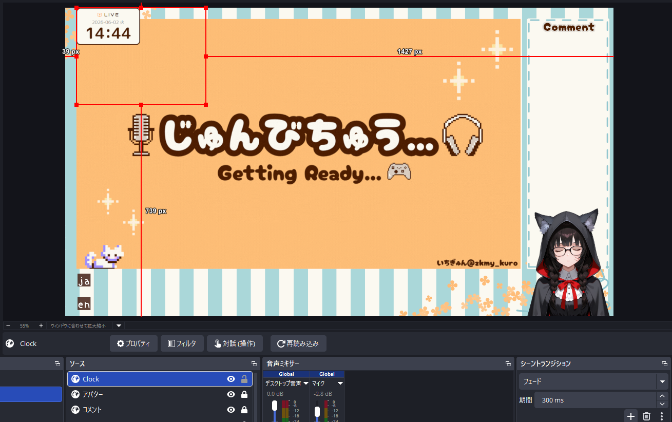
- Position in OBS scene: 9-direction anchor (↖ ↑ ↗ ← ● → ↙ ↓ ↘) for where in the scene to place the clock
- Order: reorder time / date / badge / secondary clock with ↑↓ buttons
- Text alignment:
- Horizontal: left / center / right (applies to all elements by default)
- “Per-element override” ON: set time / date / badge / secondary clock each to “auto (follow overall) / left / center / right”
Tab for applying a ready-made preset with a single click. Selecting one overwrites all settings of the current mode (Ctrl+Z to undo).
See Presets above for visual samples of every preset.
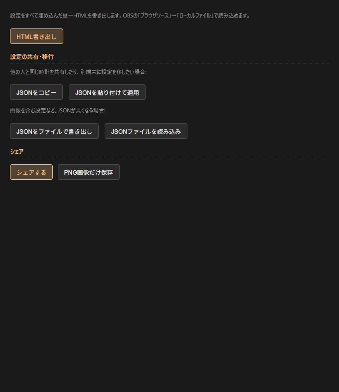
HTML export
- Export HTML: emit a single HTML file with all settings embedded. Load via OBS “Browser Source” → “Local file”
Sharing / migration
- Copy JSON / Paste JSON to apply: share JSON via clipboard
- Export JSON as file / Import JSON file: for settings that include images, where the JSON gets long
Share
- Share: share the image + text via social media / email / clipboard (share modal)
- Save PNG only: download the current preview as a PNG
In timer / count-up modes, dedicated sections appear inside the Time tab (Timer settings / Count-up settings).
Timer settings (timer mode)
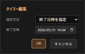
- Method:
Set end datetime/Set duration- Set end datetime: specify date + time. If already past at startup, auto-rolls forward by 24 hours → perfect for daily-repeat streams ending at the same time
- Set duration: enter hours / minutes / seconds → counts down from when the browser opens
- Expired behavior:
Stop at 00:00:00/Show negative (overflow) time - Show expired text ON/OFF
- Expired text: string shown at expiration (e.g.
時間です!) - Expired text style:
font/size (px)/color/text style (bold / italic / underline) - Hide badge at expiration ON/OFF
Count-up settings (count-up mode)
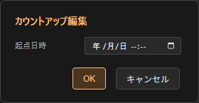
- Origin:
From specific datetime/From 0 (page load origin)- From specific datetime: specify an origin datetime → shows elapsed time from there. Useful for “days since stream start” counters
- From 0 (page load origin): starts from 0 when the browser opens. Useful for elapsed-stream time
- Origin datetime (only when origin = “From specific datetime”)
- Date area: show current datetime / show origin datetime / hide
Common to all text elements except the colon — digits, date, badge, secondary clock, AM/PM, timezone label, etc.:
- Bold (font-weight 100-900)
- Italic
- Underline
- Color picker + direct HEX input
- Font selection
There are 100+ built-in fonts, grouped into 10 categories: Japanese / Mono (for time display) / Sans / Display / Script / Korean / Chinese / Thai / Russian / System. Category names are also localized when the UI language switches.
| Category | Fonts |
|---|---|
| 日本語 (19) | M PLUS Rounded 1cNoto Sans JPKosugi MaruSawarabi MinchoShippori MinchoKlee OneZen Maru GothicZen Kaku Gothic NewMochiy Pop OneHachi Maru PopYusei MagicStickDela Gothic OneRampart OneTrain OneKaisei DecolYuji SyukuHina MinchoBIZ UDGothic |
| 等幅 (時刻表示向け) (15) | Roboto MonoJetBrains MonoFira CodeIBM Plex MonoSpace MonoVT323Source Code ProInconsolataUbuntu MonoPT MonoAnonymous ProDM MonoCutive MonoGeist MonoMartian Mono |
| Sans (11) | RobotoInterPoppinsNunitoQuicksandMontserratBebas NeueAntonLatoOutfitDM Sans |
| Display (装飾) (19) | Cherry Bomb OneDotGothic16RocknRoll OneReggae OneOrbitronPress Start 2PBungeeBungee ShadeAudiowideMonotonRighteousRusso OneBlack Ops OneLobsterPacificoSilkscreenFaster OneMajor Mono DisplayShare Tech Mono |
| Script (筆記体) (7) | CaveatDancing ScriptIndie FlowerPermanent MarkerShadows Into LightGreat VibesSacramento |
| 韓国語 (7) | Noto Sans KRNanum GothicNanum MyeongjoGaeguCute FontSingle DayJua |
| 中国語 (8) | Noto Sans SCNoto Serif SCNoto Sans TCNoto Serif TCZCOOL QingKe HuangYouZCOOL KuaiLeZCOOL XiaoWeiLiu Jian Mao Cao |
| タイ語 (4) | Noto Sans ThaiSarabunKanitMitr |
| ロシア語 (7) | PT SansPT SerifPhilosopherYeseva OneMarmeladBad ScriptMarck Script |
| System (4) | system-uisans-serifserifmonospace |
- Export HTML: from the Export tab, click “Export HTML”
- Save to any location: e.g.
C:\stream\clock.html - Add a Browser Source in OBS: Sources → + → Browser
- Check “Local file” → select the saved HTML
- Width / Height: match the clock size (e.g. 600×200)
- “Custom CSS” is not needed (everything is inside the HTML)
- Position in OBS and you’re done
If you want to place the clock in the top-left corner, set Position in OBS scene to top-left (↖) on the Layout tab before exporting — this makes fine positioning in OBS easier. The same applies to other corners / edges.
Switchable from the top right of the header (everything persists in localStorage):
- Language: 日本語 / English — applies to UI labels, hints, date locale, and the exported HTML’s text
- Theme: Dark / Light / Fancy / Handcraft
- Hide UI (
Fkey or button): hides the editor UI so the preview matches the exported look (clock only) - Display settings (a popover opens when you click the button):
- Editor display — font size (90% / 100% / 110% / 125% / 150%) / panel position (right / left)
- Preview (for visual checking only; not included in the export):
- Preview background: checker / dark / light / transparent / solid (to check how it looks against your OBS source background)
- Time preview (clock mode only): specify a date/time to see how the clock would render at that moment (weekday display, midnight / noon, year-end, etc.)
- Carry look across modes (checkbox): when switching between clock / timer / count-up, bring the current look to the new mode
- Auto-saved to localStorage: saved on every change, so closing the tab and reopening restores your work
- Per-mode isolation: clock / timer / count-up are saved as separate settings
- Undo / Redo history: rewind by individual operation (Ctrl+Z / Ctrl+Y, capped history)
- Reset: “Reset” button in the header reinitializes the current mode’s settings
- Copy JSON / Export JSON as file: outputs settings for all modes to the clipboard or a file. Useful for sharing or moving to another PC
- Paste JSON to apply / Import JSON file: restore settings from the JSON text or file you received
| Key | Action |
|---|---|
Ctrl+Z | Undo |
Ctrl+Y / Ctrl+Shift+Z | Redo |
Space | Timer / count-up Start / Pause (not in clock mode) |
R | Timer / count-up Reset (not in clock mode) |
E | Open edit popup (not in clock mode) |
F | Focus view (hide UI, clock only) — press again or Esc to exit |
Esc | Close edit popup / exit focus view |
On smartphones (screen width 768px or less), the UI automatically stacks vertically:
- Preview: top (about half of the screen)
- Menu: bottom (the rest, scrollable vertically)
- The left/right splitter is hidden (too hard to drag on touch)
- The “Panel position” setting is ignored on mobile and the layout is fixed
When using this tool for streaming or personal projects, credit is not required. But if you do credit me, it really helps motivate further development.
Standard format
TOKI×Maker by Ichigyun
https://gyungyun.dev/works/toki-maker
For stream descriptions (short)
Clock: TOKI×Maker (gyungyun.dev) / @zkmy_kuro
For general guidance, see the credit notes on the top page.